Scroll through Instagram in Jamaica on any evening and you’ll see them. A swimwear label from Kingston. A body butter line made in a kitchen in Mandeville. A Pilates studio in Montego Bay posting next week’s class schedule.
Most of them have good products. Only a few are instantly recognisable.
The difference is rarely the product. It’s the brand design.
For fashion, beauty and wellness businesses, customers usually see you long before they touch, wear or try what you sell. They see a post, a story, a tagged photo or a package in a friend’s hand. When those pieces look like they belong together, people remember you. When they don’t, you get lost in the scroll.
This guide shows you how to build an Instagram-first visual identity for a Jamaican lifestyle brand. You’ll learn:
- What brand design covers for fashion, beauty and wellness businesses
- How to choose colours, typography and imagery that work on a phone screen
- How packaging and lookbooks carry your brand beyond the feed
- The key stages of the brand design process
- The mistakes that make good products look forgettable
Let’s get into it.
What Brand Design Means for Fashion, Beauty and Wellness Businesses
Brand design is the visual system that makes your business look like itself everywhere it shows up. It is much more than a logo.
You may also hear it called branding design or brand identity design. The terms overlap, and for a small business they point to the same set of decisions:
- Logo: your main mark, plus simpler versions for small spaces like a profile photo or a clothing tag
- Colour palette: the few colours you use again and again
- Typography: the fonts on your posts, labels, price lists and website
- Imagery: how your photos and videos are shot, lit and edited
- Graphic elements: patterns, icons, textures and shapes that belong to you
- Layouts: how all of the above are arranged on a post, a box or a page
For lifestyle businesses, these choices carry extra weight because part of what you sell is a feeling.
A fashion label sells how someone wants to look and be seen. A beauty brand asks for trust, because the product goes on skin and hair. A wellness studio sells an atmosphere, whether that is calm, energy or a sense of belonging.
Customers can’t test any of that through a screen. Your visuals have to do the talking.
Why Visual Identity Matters for Lifestyle Brands
A strong visual identity does practical work for your business every day.
It earns a second look. People decide in a moment whether to stop scrolling. A clear, consistent look gives them a reason to pause.
It supports your prices. A handmade soap in a plain bag and the same soap in a well-designed box are judged very differently. Design shapes what people believe a product is worth before they try it.
It makes you recognizable without your logo. When your colours, fonts and photo style stay the same, followers know a post is yours before they read the name.
It helps beyond Instagram. Think of a boutique in Kingston deciding which local labels to stock, a hotel gift shop on the north coast choosing skincare for its shelves, or a customer in the diaspora ordering online without ever holding the product. Each of them is judging by what they can see.
It saves you time. Once the rules are set, you stop redesigning every post from scratch.
How to Build an Instagram-First Brand Look
Instagram-first means you design for the smallest, busiest place your brand appears, then scale up from there. If your brand works in a tiny profile circle and a crowded feed, it will work on a box, a banner and a website.
Start with the four building blocks.
Brand colours
Pick a small palette and commit to it. For most lifestyle brands, that means:
- One or two main colours that people will link to you
- One or two neutrals for backgrounds and text
- One accent colour for sale tags, buttons and highlights
Jamaica gives you plenty to draw from: sea blues, hibiscus reds, the deep green of the hills, sand, clay and sunset orange. You don’t need to use the flag colours to look Jamaican, and many premium local brands deliberately don’t.
Let your product guide you. A natural skincare line might lean on warm earth tones and cream. A dancehall-inspired streetwear label can carry bold, high-contrast colour. A yoga studio may want soft, quiet shades that feel like a deep breath.
Then test the palette where it matters. Check it on a phone in bright sunlight, and check it against a range of skin tones if people appear in your photos.
Typography
Two fonts are enough: one with personality for headlines, and one clean, readable font for everything else.
Keep text on posts large. Most people will read it on a phone held at arm’s length, often outdoors. Thin, pale script fonts look lovely on a laptop and vanish on a small screen.
Use the same fonts on your price list, your hang tags, your class timetable and your story highlights. That repetition is what builds recognition.
Imagery
Photography is where fashion, beauty and wellness brands win or lose. Decide on a style and stick with it:
- Light: bright natural daylight, golden hour or moody studio light. Choose one as your default.
- Setting: beach, garden, city street, plain studio backdrop. A few repeat locations are better than a new one every week.
- People: show the customers you actually serve. Real skin texture, real hair types and real body shapes build trust, especially in beauty.
- Editing: use one preset or one editing approach so every photo shares the same warmth and contrast.
A Kingston resort wear label, for example, could shoot every collection in morning light against white walls and greenery. After a few months, that look becomes part of the brand.
Visual style
This is everything that ties the rest together: how much empty space you leave, whether your corners are sharp or rounded, and whether you use patterns, line drawings or textures.
Build a small set of post templates for the content you share most. For a beauty brand, that might be a product feature, an ingredient spotlight, a customer review and a how-to. For a studio, it might be the weekly schedule, an instructor introduction and a class reminder.
Before you post, look at your grid as a whole. Do nine posts in a row look like one brand?
Packaging Design: Your Brand in the Customer’s Hands
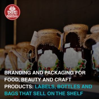
For a product business, packaging is the first physical moment a customer has with you. It is also free advertising. A well-designed bag carried through a plaza or a box opened on someone’s story reaches people you never paid to reach.
Good packaging supports brand recognition in a few simple ways:
- It repeats what people saw online. The colours, fonts and logo on the box should match the feed that made them buy.
- It is easy to spot. On a shelf beside ten other body oils, a clear colour and a readable name do most of the work.
- It photographs well. Matte finishes, clean labels and one strong brand colour look better on camera than glossy, crowded designs.
- It suits real conditions. Jamaica is hot and humid. Labels need to survive heat, oil and a steamy bathroom without peeling or smudging.
You don’t need to customize everything. A small brand can go far with a few low-cost pieces done consistently: a branded sticker, tissue paper in your main colour, a stamped kraft mailer and a thank-you card in your fonts.
A few examples of how this plays out:
- A clothing label can carry its identity through hang tags, woven neck labels and garment bags.
- A skincare line can use one label layout across every jar and bottle, changing only the product name and an accent colour.
- A wellness studio has packaging too. Gift cards, class passes, branded water bottles and retail items like candles or oils all count.
One practical note: if you sell packaged cosmetics or body care, check the Bureau of Standards Jamaica’s guidelines on labelling before you print. It is far cheaper to adjust a design file than to reprint a full run of labels.
How Lookbooks Help Fashion and Lifestyle Brands Present Their Collections
A lookbook is a curated set of images that shows a collection the way you want it to be seen. It is less about selling item by item and more about showing the world your brand lives in.
For a fashion label, a lookbook does three jobs:
- It tells the story of a collection. The location, styling and mood explain who the clothes are for.
- It gives buyers and press something professional to review. A boutique owner or stylist can see the full range in a few minutes.
- It feeds your content calendar. One well-planned shoot can supply weeks of posts, reels, website banners and email images.
A simple lookbook usually includes a cover, a short introduction, full-look images, a few detail shots, and product names with sizes and prices or ordering details.
The design should follow your brand rules. Use your fonts, your colours and your usual photo style, so the lookbook feels like an extension of your Instagram page.
Imagine a swimwear label releasing a summer collection. It shoots on one stretch of coast in Portland, publishes the lookbook as a PDF and an Instagram carousel, and reuses the same images on its website and in WhatsApp catalogues. One shoot, one look, every channel.
Lookbooks are not only for fashion. A beauty brand can build a seasonal gift guide the same way, and a wellness studio can create a retreat or membership brochure using the same approach.
Keeping Your Brand Consistent Across Instagram, Your Website and Every Touchpoint
Instagram may be where people find you, but it is rarely the only place they meet you. Consistency means a customer gets the same impression at every step.
| Touchpoint | What to keep consistent |
| Instagram profile | Profile photo, bio wording, highlight covers, post templates, photo editing |
| Website or online store | Same colours, fonts and product photography as your feed |
| WhatsApp Business | Logo as profile photo, catalogue images in your photo style, matching greeting message |
| Packaging | Brand colours, logo placement, label layout, inserts |
| Physical space | Signage, price cards, mirrors, wall colours, uniforms or aprons |
| Printed items | Hang tags, gift cards, flyers, class schedules, loyalty cards |
| Pop-ups and markets | Banner, table cloth, shopping bags and display cards that match your online look |
The way you write should match the way you look. A calm, minimal studio brand that sends loud, emoji-heavy messages feels like two different businesses. We covered this in more detail in our guide to keeping one brand voice across WhatsApp, Instagram and Facebook.
Your website deserves special attention, because that is often where a follower becomes a paying customer. If the store looks nothing like the feed, people hesitate. Our article on e-commerce branding that builds customer trust explains how to carry your identity into an online store.
The simplest way to stay consistent is a short brand guide. Even two pages covering your logo, colours, fonts, photo style and a few dos and don’ts will keep you, your photographer and your printer on the same page.
The Brand Design Process: Key Stages
A good brand design process moves from thinking to making, in that order. Skipping the early stages is the main reason brands end up redesigning a year later.
1. Discovery
Start with questions. Who is your customer? What do you want to be known for? What do you charge, and who else is competing for the same buyer? A label selling linen resort wear to visitors and a label selling graphic tees to university students need very different looks, even if both are based in Kingston.
2. Research and audit
Look at what already exists. Review your current logo, feed, packaging and website. Then look at competitors, both local and overseas, to see where everyone looks the same and where there is room to stand apart.
3. Positioning and mood boards
Agree on three or four words that describe the brand, such as “calm, natural, premium” or “bold, playful, street”. Then turn those words into mood boards with colours, textures, type and photo references.
This is the cheapest stage to change your mind. Use it.
4. Identity design
Now the core pieces are designed: logo and its variations, colour palette, typography and graphic elements. If you want this handled by a professional team, our brand identity design service covers the logo stage of this work.
5. Application
The identity is applied to real items: Instagram templates, highlight covers, labels, bags, hang tags, lookbook layouts and signage. This is where you find out whether the system holds up.
6. Testing
Check everything in real conditions. View posts on a phone. Print a label and stick it on the actual jar. Hold a hang tag next to the garment. Fix what doesn’t work before you order in bulk.
7. Guidelines and rollout
Record the rules in a brand guide, then update your touchpoints in a sensible order. Most small brands start with Instagram and packaging, then move to the website and printed items as old stock runs out.
What This Looks Like for Jamaican Businesses
These are illustrative examples, not client projects, but they show how the same process leads to very different results.
A streetwear label in Kingston. The brand draws on sound system culture and city life. It chooses black, white and one loud accent colour, a heavy condensed font, and flash photography shot at night. Its packaging is a black mailer with a single bold sticker. Every drop gets a short lookbook released as a carousel.
A natural hair and skincare line in St Elizabeth. The products use local ingredients such as castor oil and coconut oil. The palette is warm cream, deep green and brown. Labels follow one clean layout, with ingredients listed clearly. Photos are shot in soft daylight with real customers and visible hair texture.
A yoga and wellness studio in Montego Bay. The studio wants to feel calm and welcoming to both residents and visitors. It uses sand, soft blue and plenty of white space, with a rounded, friendly font. Its weekly schedule, class passes, wall signage and retail shelf all share the same look.
Three businesses, three different identities. What they share is a clear decision about who they are, applied the same way everywhere.
Common Brand Design Mistakes to Avoid
- Treating the logo as the whole brand. A logo with no colour, font or photo rules around it can’t keep your feed consistent.
- Copying an overseas brand’s look. It may be pretty, but it won’t be yours, and your customers have probably seen the original.
- Changing style every few weeks. A new font or filter each month resets recognition to zero.
- Designing only for the feed. If the label, bag and website were never considered, the brand falls apart once someone buys.
- Using too many colours and fonts. More choices create more noise. Tight palettes look more premium.
- Putting small text on posts and labels. If it can’t be read on a phone or from a shelf, it isn’t doing its job.
- Relying on inconsistent photos. Mixed lighting, backgrounds and edits make even a good product look unreliable.
- Ordering packaging before testing it. Always print a sample and check it on the real product first.
- Keeping the rules in your head. Without a written guide, every new designer, photographer or staff member will guess.
Actionable Tips for Business Owners
You can start improving your brand design this week.
- Audit your last nine posts. Screenshot your grid and ask a friend what kind of brand it looks like. Compare that with what you want to be known for.
- Write your three brand words. Put them where you can see them every time you create content.
- Limit yourself. Choose up to five colours and two fonts, then save them in your design app so they are always one tap away.
- Build five templates. Cover your most common posts so you never start from a blank page.
- Pick one photo style. Choose your light, your backgrounds and one editing preset, and use them for a full month.
- Order one packaging sample. Photograph it, carry it around and see how it holds up before buying in bulk.
- Match your link-in-bio page. The page people land on after tapping your profile should look like the feed they just left.
- Protect your name. Before investing in signage and packaging, look into registering your trade mark with the Jamaica Intellectual Property Office.
- Create a one-page brand guide. Share it with anyone who makes content or printed items for you.
Frequently Asked Questions
What is brand design?
Brand design is the visual system that represents your business. It includes your logo, colours, fonts, imagery, graphic elements and the rules for using them across social media, packaging, your website and printed items.
Is brand design the same as a logo?
No. A logo is one part of it. Brand design covers everything a customer sees, so your business looks consistent wherever it appears.
Why is Instagram-first brand design useful for Jamaican lifestyle businesses?
Many fashion, beauty and wellness customers discover brands on Instagram before they visit a store or website. Designing for a small screen first makes sure your brand is clear and recognisable in the place most people meet it.
Do I need custom packaging from the start?
Not necessarily. Stock boxes, bags or jars with well-designed stickers, labels and inserts can look professional. You can move to fully custom packaging as your volumes grow.
What should a fashion lookbook include?
A cover, a short introduction to the collection, styled full-look images, detail shots, and product names with sizes, prices or ordering details. It should use your brand fonts, colours and photo style.
How long does the brand design process take?
It depends on the scope. A logo and basic identity takes less time than a full system with packaging, templates and a lookbook. Ask for a timeline at the start, and allow time for feedback and testing.
Can I do my own brand design?
You can make a good start with templates and a clear set of rules. A professional becomes valuable when you need an original logo, packaging that prints correctly, or a system that will hold up as the business grows.
How often should I update my brand design?
Rarely. Recognition comes from repetition. Refresh seasonal content and campaign visuals as often as you like, but keep your core identity steady.
Final Thoughts
For fashion labels, beauty brands and wellness studios, how you look is part of what you sell. Strong brand design makes sure the look is deliberate and the same everywhere.
Here’s the short version:
- Decide who you are before you design anything
- Choose a small palette, two fonts and one photo style
- Design for the phone screen first
- Carry the same look onto packaging, lookbooks and your website
- Test before you print
- Write the rules down
Start with the nine-post audit. It takes ten minutes and will show you exactly where your brand is consistent and where it drifts.
If you’d like a second opinion on what your brand needs next, you can book a brand discovery call with the Dope Brand Studio team. We work with businesses across Jamaica and the Caribbean, and we’re happy to talk through where to begin.