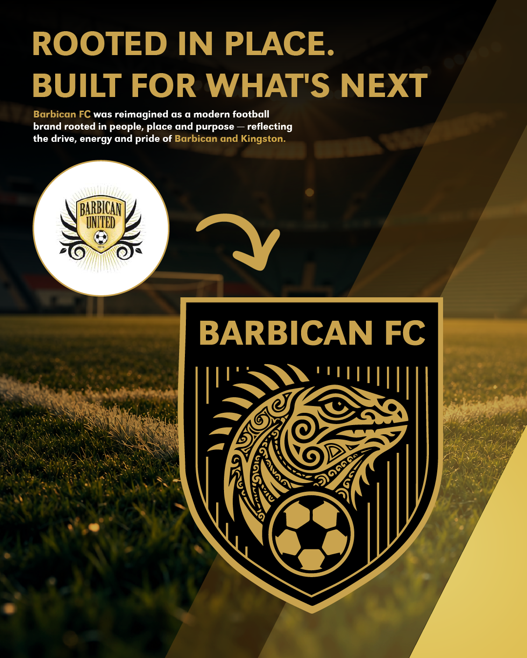
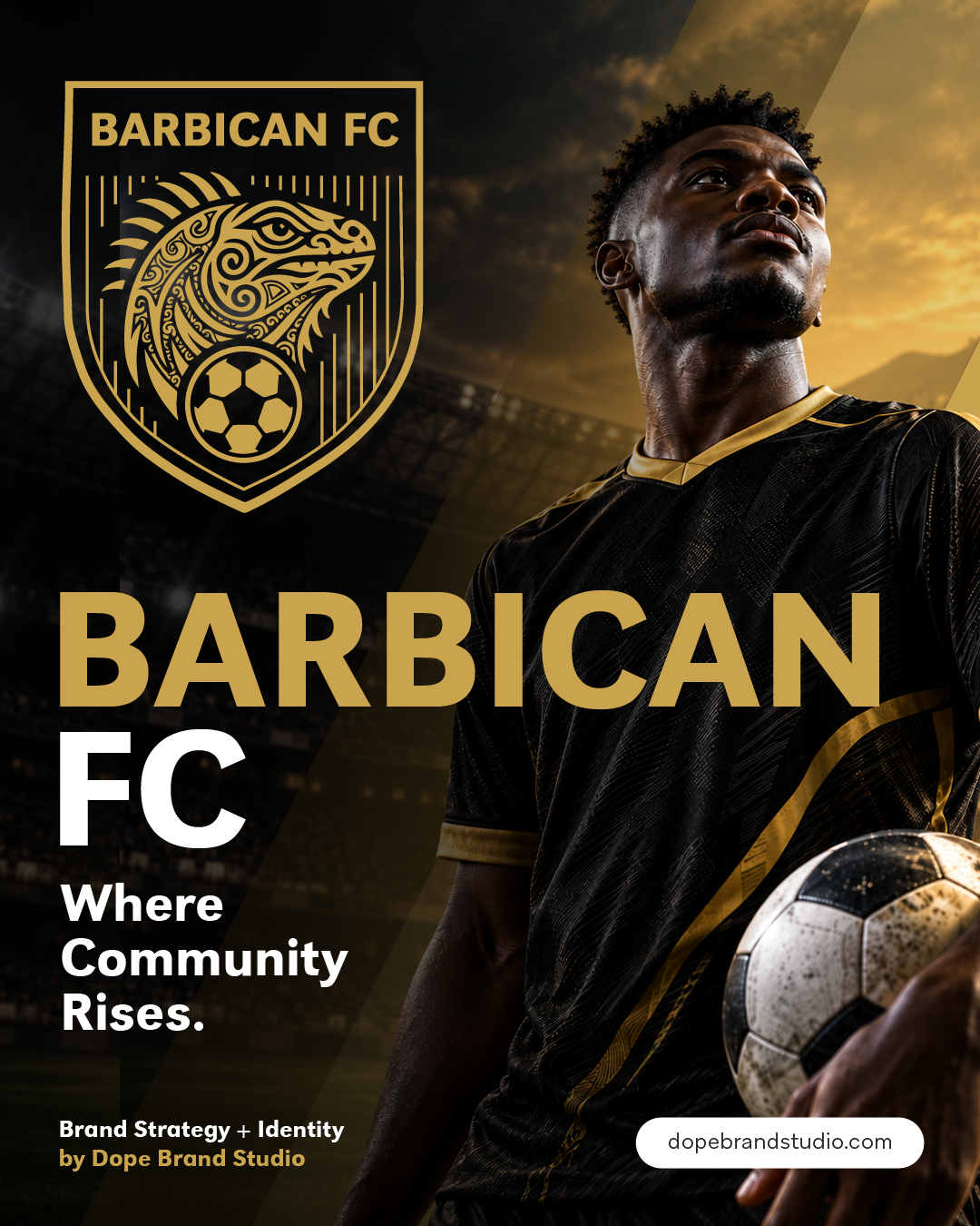
The process began by defining what Barbican FC should stand for beyond football. Community, culture, elevation, integrity and resilience became central to the brand foundation, helping shape an identity that could feel distinctly Barbican while supporting the club's ambitions for the future.
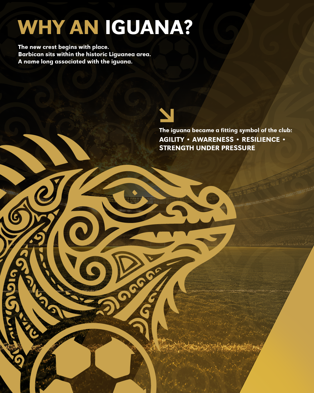
At the centre of the new crest is the iguana, chosen for its connection to place. Barbican lies within the historic Liguanea area, a name long associated with the iguana. Its characteristics of agility, awareness, resilience and strength under pressure also provided a natural connection to the mindset of the club.
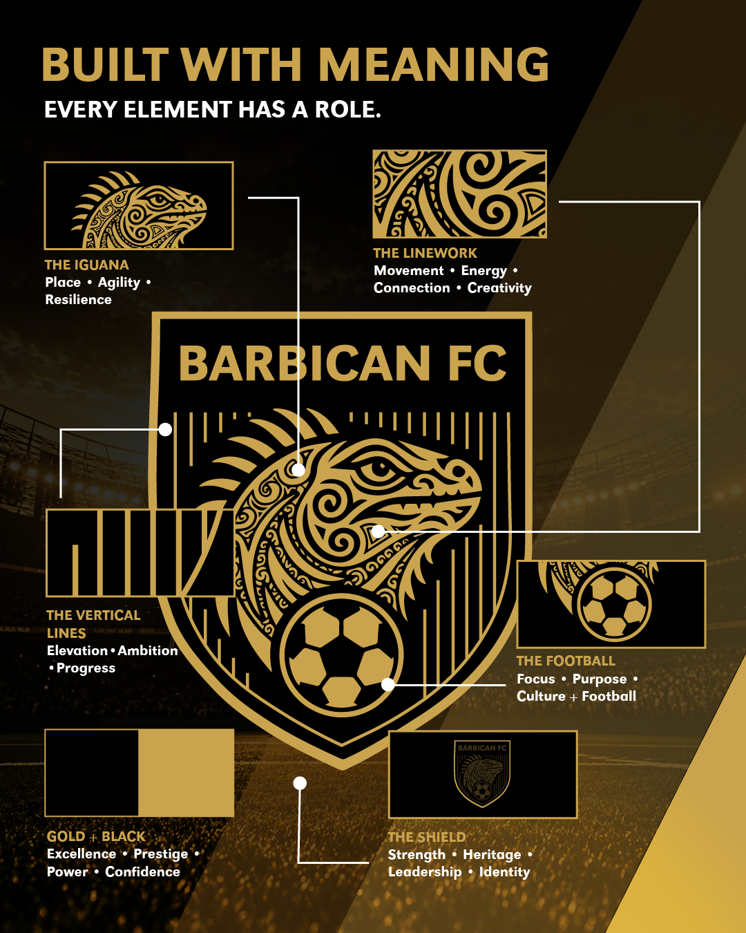
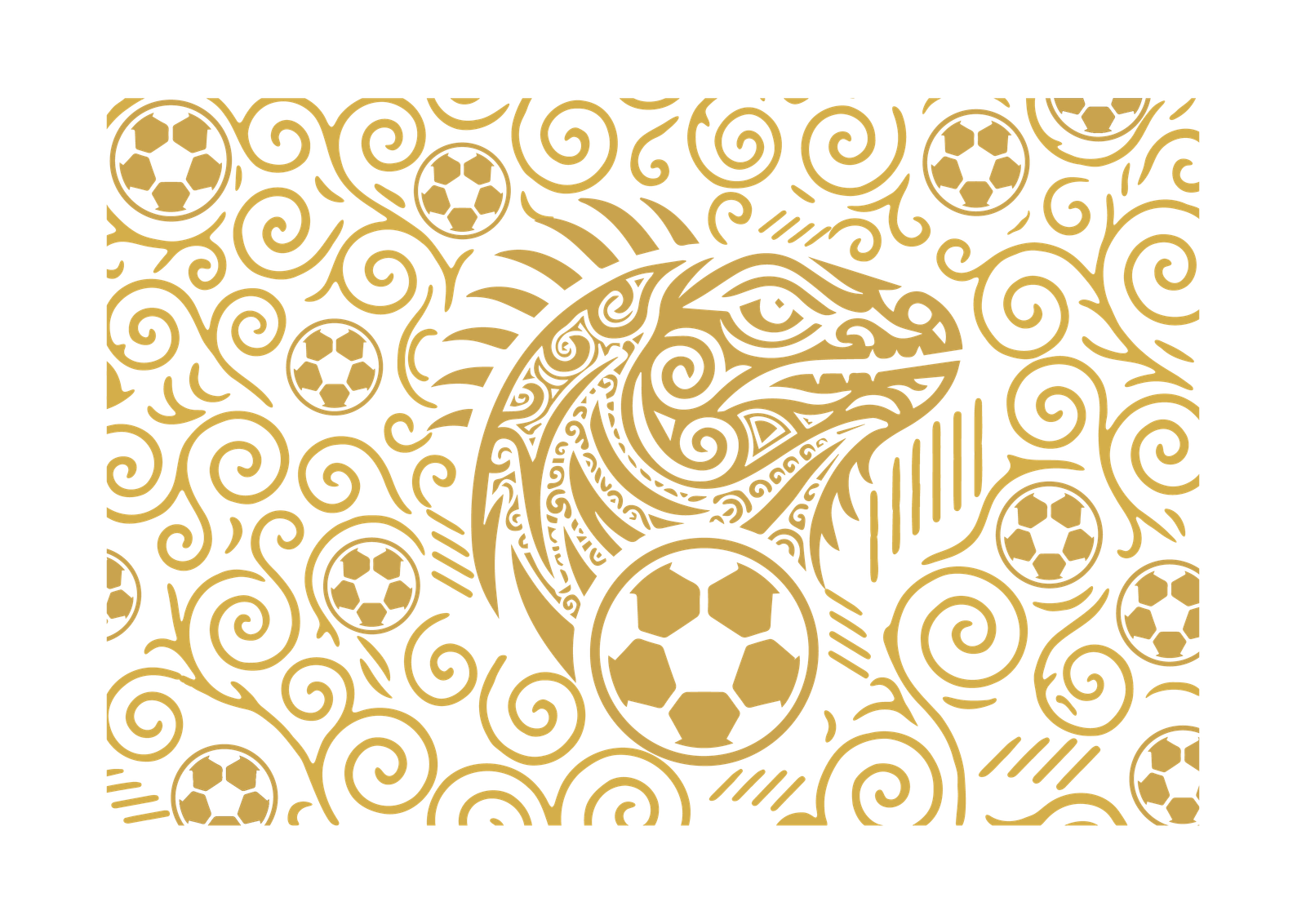
That story was developed into a broader visual system. Caribbean inspired linework brings movement, energy and creativity to the iguana. The shield communicates strength, heritage and identity, while the football grounds the crest firmly in the sport. Vertical lines introduce structure and upward movement, reflecting the club's focus on progress and elevation.
A bold palette of gold and black completes the identity, combining excellence and achievement with strength, confidence and a professional presence.
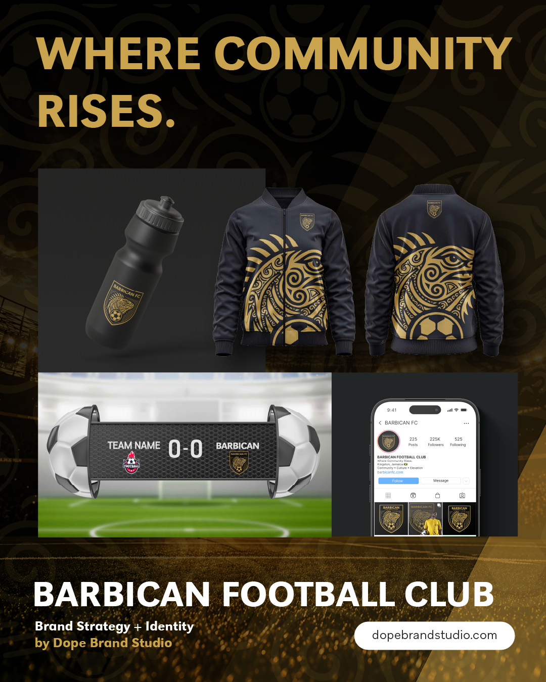
The work did not end with the creation of the identity. Dope Brand Studio has continued working with Barbican FC to translate the brand across practical touchpoints, including sponsorship materials, signage and social content, helping create greater consistency in how the club presents itself to supporters, partners and the wider community.
Communication documents
More Than a New Crest
Conclusion
The Barbican FC rebrand created more than a new visual identity. It established a foundation the club can continue to build upon as its ambitions, partnerships and community presence grow.
From the symbolism within the crest to the way the identity now extends across communications and physical touchpoints, each element contributes to a more cohesive and recognizable Barbican FC.
The result is a brand designed to represent where the club comes from while giving it the confidence and flexibility to move forward.
Barbican Football Club. Where Community Rises.
Brand Pattern Design
At Dope Brand Studio, we build brands with purpose, creating the strategy, identity and experiences needed to show up with clarity and consistency. Our work with Barbican Football Club demonstrates how thoughtful brand strategy can translate into a distinctive visual identity and continue across the touchpoints that bring the brand to life.
If your business or organization is ready to reposition, rebrand or build a stronger foundation for growth, let’s discuss how Dope Brand Studio can help turn that next chapter into a brand built to move forward.